The Polshek Partnership's High Line hurdling hotel
 It's been around the blogosphere for a while... and we've mused on the nice lap dance it gives the High Line park. But in a striking bit of coincidence, I just recently had the opportunity to see The Standard with my own eyes, and NY Time critic Nicolai Ouroussoff has reviewed it. So I'm inspired to post a nice, old-fashioned bit of archiporn... yes, lots of pictures after the jump. But I'll keep writing so you can say you read the articles.
Sure, it's a bit over-the-top and extravagant in the face of our current economic woes, but why not wax a bit nostalgic... nay... optimistic for the good days to come. Heck, the hotel hasn't even been completed! And neither is the aforementioned elevated park. So, I suppose we're looking to the future.
Link: NY Times
Link: Standard Hotel NYC
Firm: Polshek Partnership Architects
Related: "Down-to-Earth Masterpieces of Public Landscape Design" (L+L)
L+L Map: The Standard New York
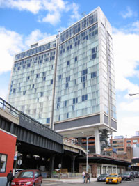
OK, a few words to orient: The Standard New York is the fourth hotel in the boutique chain from Andre Balazs (I'm partial to the one in downtown Los Angeles... I like the pseudo-corporate overtones of the former oil company headquarters... but anyway). The NYC incarnation is located in Gansevoort Market--more commonly called The Meatpacking District. It is the first ground-up structure built as a Standard Hotel and is the creation of New York firm Polshek Partnership Architects.
View Land+Living in a larger map
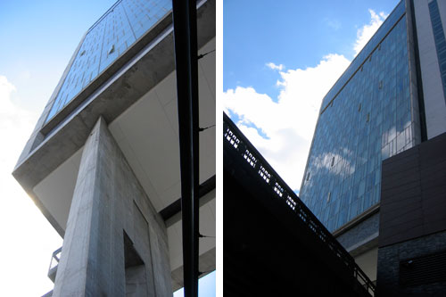
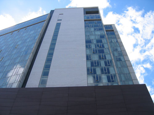
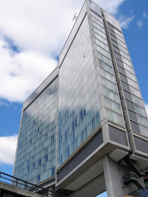
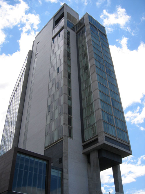
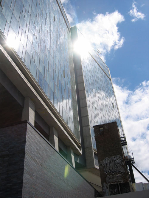
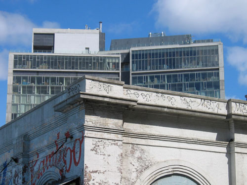
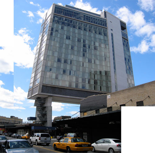
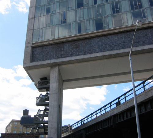
Some aspects of the design work well in the sort of hip-ironic (but not overly clever) mold the previous Standards established. The International Style aesthetic contrasts wonderfully with the surrounding meat packing district and the sublime urban ruin of the High Line. The studied asymmetry, Corbusian sense of massing, warping bend in the tower, and playful details reflect the jumbled context with its shifting sense of scale. And of course, the most striking move is how the towering structure straddles the High Line--deftly floating above the neighborhood.
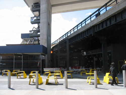
Other aspects of the project are not as convincing. While the monumental gestures and distant vistas are impressive, some of the more intimate pedestrian experiences reveal the design's weakness. The opportunity to explore the contrasting relationship of the modern vocabulary of the tower as it meets the ground plane and wraps beneath the High Line at the lobby is largely squandered. There are a few nice moves to highlight the contrast between old and new, but the architecture of the lobby feels divorced from the tower. But my disappointment with the design comes mainly from choice to insert an uncomfortably faux-historic brick structure partially beneath the High Line to the south of the main entry. It is meant to look like an adaptive reuse of an existing structure; like an organic piece of the urban fabric absorbed into the project. But it isn't. Rather it is a lazy element of the design meant to "blend" with the surrounding streetscape and heighten the effect of the modern tower hovering above. I get it... but I think it is a missed opportunity. And just to bitch some more, the inset veneer of brick on the lower section of the tower seems a bit gratuitous...
But overall the design achieves a wonderful push-and-pull; simultaneously contrasting and merging with the surroundings. It works.
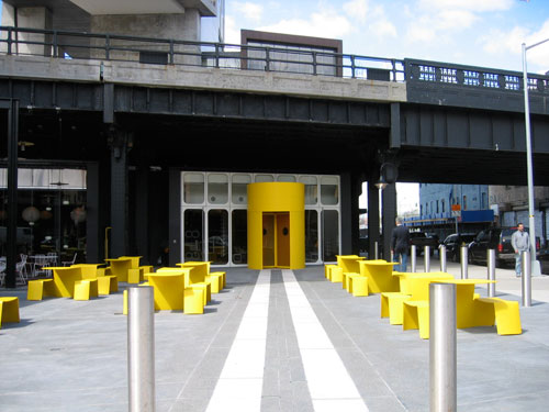
Plaza and entry to hotel lobby tucked beneath the High Line.
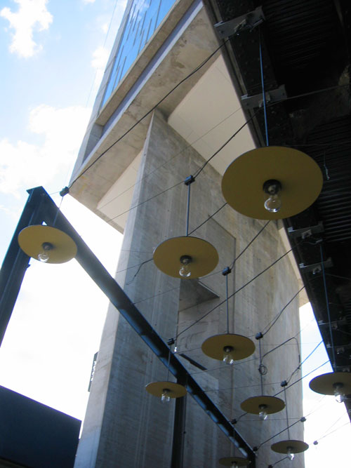
Lighting strung over patio area beneath the High Line adjacent to the lobby.
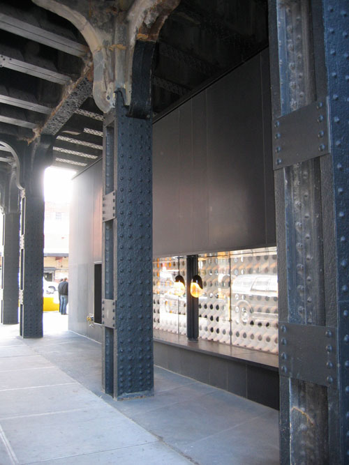
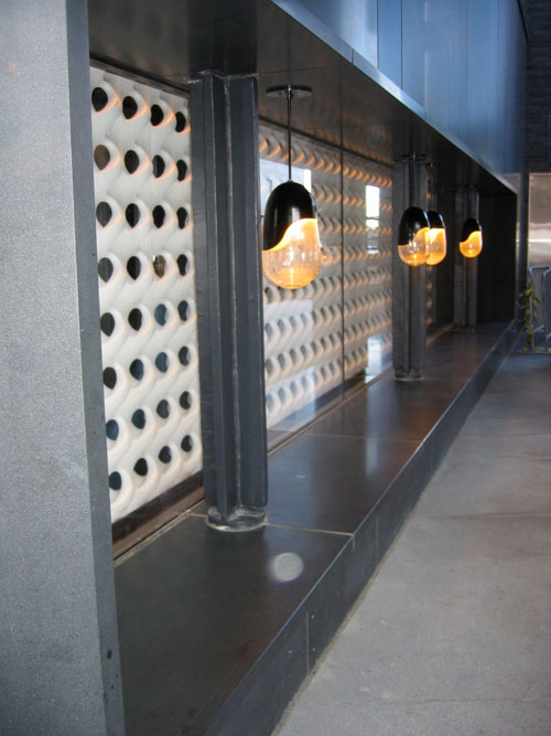
Detail of lobby window beneath the High Line.
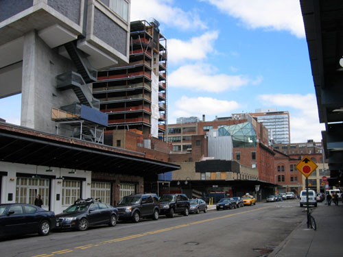
The faux-historical structure along the street mimics the local vernacular with its brick facade and steel canopy. It "repairs" the urban fabric, but seems like a wasted opportunity.