

The new animated logo of The Cooper Union makes me go "hmmmm"
In the world of graphic design, there is perhaps no more basic, yet simultaneously complex design problem than the logo. A logo (or logotype) is ultimately an identifying symbol; the visual marker for a brand. But what are the elements of a great logo? Traditionally, a "good" logo should meet some basic criteria, and there are countless rules of thumb by countless designers, but these four basics described by designer David Dairey are how I have always thought of what makes a good logo:
it is describable, memorable, effective without color, and scalable.
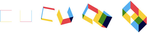
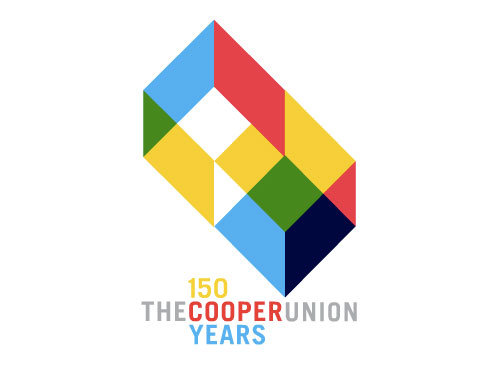
There are also countless examples of logos which do not meet these criteria, most are cringe inducing. But in this digital age, there are examples of logos which are designed to inhabit the confines of digital space; and the confines are, well, much less confining. The new logo for The Cooper Union is perhaps the best example of this trend. It is elemental and basic, yet describes the complex of the institution it represents (view: full animation, website intro version). It meets the first two criterial of basic logo design, it does not meet the third, and I think it is questionable on the fourth.
But most notably, it is clear that this logo was designed for digital space; it relies on movement to fully reveal its meaning. While I like the design, I wonder how this logo can function for the institution when it comes to the (current) necessity of static use. And in general, what does this mean in the world of identity design?
Link: Cooper Union
Designer: Doyle Partners
Article: NY Times
Have we reached an age where we can assume that a logo will be primarily experienced in digital space? With the increasing occurrence of digital signs and billboards, and the pervasiveness of the internet, perhaps it makes little sense to design within the constraints of antiquated printing processes and static applications.
Why should a designer be limited by the necessity to place a logo on a material devised 17 centuries ago? And when many people in this world have the resources to print in full color on their desks at home, why would a designer limit themselves to designing in a single color? It is only a matter of time before interactive paper becomes commonplace. And so the world of graphic design is faced with redefining the standard of visual markers in an ever more complex and over stimulated world.
Delivery of Flowers and Gifts to Chennai, Coimbatore, Thane and all over Tamil Nadu.
Logo represents the whole business