

The Sunday CA Boom Home Tour with galleries and inconsequential unsubstantiated archi-babble...
 It is not in our tradition to pull punches. Unlike Washington, our opinion is not easily bought by lobbyists or big business (ok, ok, Time Warner has not tried yet, nor have they returned our numerous phone calls... but, hypothetically speaking...).
Fine, we do not have any deep-pocketed sponsors or sugar parental units, so we can pretty much say what we want.
It is not in our tradition to pull punches. Unlike Washington, our opinion is not easily bought by lobbyists or big business (ok, ok, Time Warner has not tried yet, nor have they returned our numerous phone calls... but, hypothetically speaking...).
Fine, we do not have any deep-pocketed sponsors or sugar parental units, so we can pretty much say what we want.
It is in this context that we feel obligated to state the undeniable: CA Boom 4 ROCKED! We are not sure how they manage to get better and better every year, but Charles and the crew are doing it, and doing it well.
This last day featured 5 prime examples of the Schindleresque idea of California living (except none of the examples suggested sharing your kitchen and your wife with your arch nemesis that lived in the next room over...). Inside outside living, the blurring of boundaries, new usage of materials and products, and a most noticeable green trend were a common theme throughout the abodes. You want specifics you say? Okiedokie then, check it (click project name for photo galleries, descriptions after the jump):
- Marcasel Residence
Frank Fitzgibbons Architects (Michael Pearce) - Pearson/Trent Remodel
Escher Gune Wardena Architecture - Sheller Borunda
Richard Seltzer Architects and Orange Street Studio
Marcasel Residence
Frank Fitzgibbons Architects (Michael Pearce)
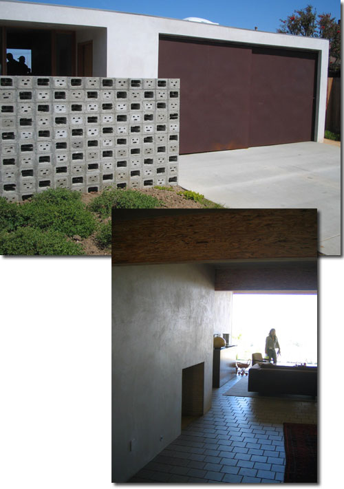
This unusually long and narrow lot is populated by an unusual, long and narrow building, which is actually made up of several individual structures strung together by wavy canopies. Two bookend volumes sit at each end of a pool and Jacuzzi courtyard, affording the exterior living space privacy from neighborly peepers, and... separating it from the canine agility course in the back (captured beautifully by Curbed LA. Yes, we were surprised too, and no, I did not do so well when I tried it out... We were later told that the area had been the location of a dog-racing track back in the day.
Spatially this house was quite interesting due to its immensely linear layout, the inside outside spaces, and the innovative and unexpected usage of skylights all over. In our humble opinion, too many materials and too many colors… in fact, the house brought back some po-mo memories, and not necessarily the good ones (if there are any). Simpler moments, like i.e. the horizontal wooden fence with the aluminum channel were more successful than i.e. the double-height, blue kitchen volume housing the birch veneer kitchen...
Pearson/Trent Remodel
Escher Gune Wardena Architecture
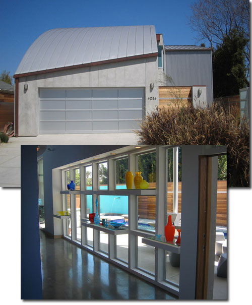
The sophistication shown by the organizers at this junction is very pleasing. They manage to amplify the experience of viewing interesting and well-crafted structures by choosing to have drastically different projects follow each other on the tour. The Pearson/Trent Remodel is based on a "modest post WW2 bungalow" and is striking in its simplicity and starkness.
The architects expanded a small, L-shaped bungalow into a rectangular house that is defined by its exposure to a panoramic view of Century City and the hills of Los Angeles. This "viewing machine" approach is risky, as most architects know, but in this case it is quite successful due to the very disciplined approach of the architect duo. The gradually height expanding living/dining/cooking area and the patio are separated by oversized glass pocket doors that can completely disappear. The usage of the same stucco finish and floor tile inside and out add to the "inside-outside" effect beautifully. The architects most likely had to work on a somewhat narrow budget, which might explain the discipline with which "money shots" like the sliding door windows were deployed.
Sheller Borunda Richard Seltzer Architects and Orange Street Studio (landscape)
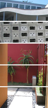
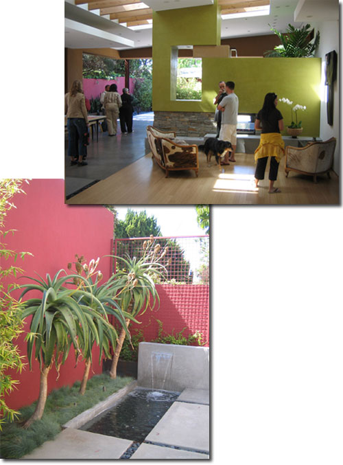
If one still thinks that the sequence of houses on this tour is accidental, then this project should lay all doubts to rest. A 50’s single-family bungalow in a cul-de-sac finds itself added to with an extremely colorful, very expansive and open structure, which seems to have natural light flowing through it from almost every possible angle and position. Again inside outside all over.. The landscape design by Orange Street Studio is very seductive and fitting, and the "Barraganesque" wall colors serve as a beautiful backdrop to the aloe.
The master suite looks out onto the smaller, private garden, while the living/dining/cooking spaces are oriented towards the more traditional "public" courtyard that seems to flow in and out of the space due to the (again) massive glass pocket doors. Meandering throughout one there is constant surprise about smaller and "in your face" details and ideas, i.e. the water feature above the bright green broken glass fireplace, underneath the exposed roof rafters and skylight... or the master bath, with floor to ceiling glass and glass bowl sinks that sit in a bed of white river pebbles. This house is based on so many ideas and juxtapositions; it almost tries to do too much for its own sake. We will not address the practicality of loose white river rock and glass sinks when encountering tooth paste and brushed hair, but we think this house felt like a furniture and wall treatment showroom. Many good ideas, but they do not seem to come together to create a whole. The garden, however, outstanding!
To be continued...