

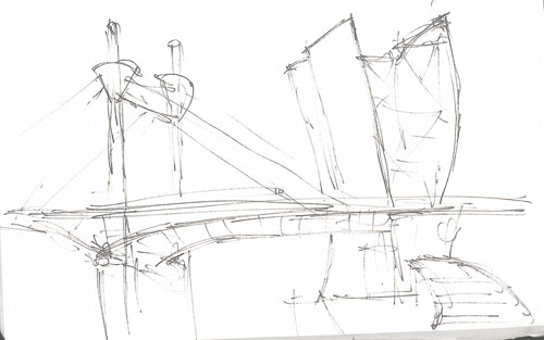
Old sketches of the Guggenheim.
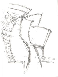 Dan Hill reposted his sketches of Gehry's Guggenheim:
"I'm not going to apologise for the hasty, impressionistic style of the sketches. Having tried and failed to draw the thing vaguely accurately, I decided the only possible response was to let go. A decent monograph about Gehry's work notes his own preferred drawing style (it's amazing how many drawings he produces, given how his work is presumed to be entirely computer-generated) - Gehry lets his pen flow across the paper, rarely if ever lifting it from the page. He likens it to an ice-skater, sweeping around the 'canvas' but not leaving the ice. I wasn't aware of this when I did these drawings, but inspired by Rodcorp's recent experiments in 'How simply and recognisably can we draw buildings?', in turn inspired by Things Magazine's post on buildings as logos (including 'building logotype tennis' by Jonathan Bell and I in the comments there), I'm posting these sketches here anyway. The only way I could think of representing the sinuous form of Gehry's Guggenheim was let the pen go. Bearing in mind Rodcorp's question, are these incredibly quick and 'careless' scribbles recognisably Guggenheim?"Via: City of Sound
Artist: Dan Hill
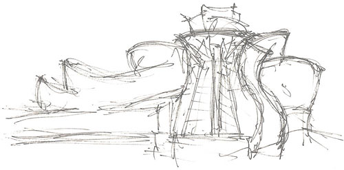
More sketches and continuation of the article at City of Sound.