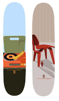
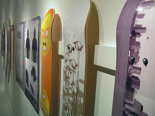
 Due to the large number of inquiries regarding the "super fantastik" skateboard designs by Tony Larson from Agents of the Area, we decided to investigate a bit.
The findings might shock you, so if you have a "mobilia eamesis heart condition", or any kind of bladder weakness when it comes to issues of design excellence, please, STOP READING NOW!
For the rest of us, we are sorry... The designs we featured are a couple of years old, and apparently they have already reached cult status. Your best bet would be to try Ebay or something similar, but good luck with that one.
HOWEVER, fear not, since Tony has provided us with a sneak peek at what promises to easily be as hot a collection of mid-century modernist design artifacts on decks as his first version. He tells us they are to be released sometime this fall. So, I dunno about the rest of you, but I am gettin' in line! And I might buy a couple of the Eames stickers that they feature on Crailtap, just to make the wait bearable.
Last, but not least: PEOPLE! "GIRL" Skateboards are not "skateboards for girls..." It's a cool and hip name of a brand, kinda like "Blind"(not exclusively for visually impaired children),"Bones" (no, not an indication of the materials used), "Birdhouse"(sounds oh so tame and civilized...but guess what)... And then there is "Uncle Touchy" and "Sick Stick." 'Nuff said.
Link: Agents of the Area
Link: Crailtap
Reference: Skate like a girl! (L+L)


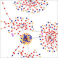 Here is an interesting way to look at the underlying code structure of a website. German blogger Ahref has written an app that graphically charts the hierarchy of a website's HTML tags. Shown on his site are graphs of many well known websites such as Google, CNN, Apple, etc.... pretty cool.
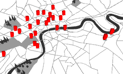
 The Smithsonian’s Cooper-Hewitt, National Design has announced the winners of the seventh annual National Design Awards. The finalists and winners will be honored at an event on October 18, 2006.
 IDEO is what the dot.com companies tried to be and failed. A place where imagination is rewarded, and failure is just part of the path to success. IDEO is fueled by team creativity, and they believe that your company should be too. That's why they have produced Method Cards, a set of 51 cards that are meant to get your team inspired and on the path to great design.
 Redstr/Collective is the design initiative of Alex Valich and Christine Warren, partners in business and life, who's approach to design is eclectic, inspired and just plain fun. They describe themselves a DJs of design who sample, mix and spin to get the desired result. Their Web site design is indicative of the "tongue-in-cheekiness" of their products like beautifully decorated sickness bags, and shelves that are highlighter colour. How about hip-hop Christmas tree ornaments?
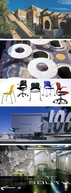
 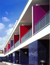 Located in the South London suburb of Tulse Hill, Brixton, the school acts as a community hub both visually and physically. The original project brief called for a building of high quality to house a complex program of multiple educational needs.
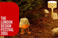 The third London Design Festival is taking place all over London, September 15 – 30, 2005.
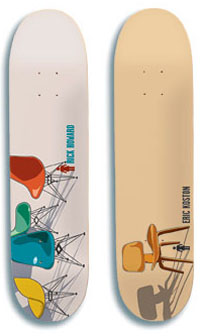 Can we assume to all agree on the premise that skateboards are cool, and that the act of skateboarding is even cooler? And Eames furniture, veeery cool indeed, right? So, if everyone at any design school knows about these icons of coolness, then how come nobody has come up with combining the two until now?! Shame on all of you!
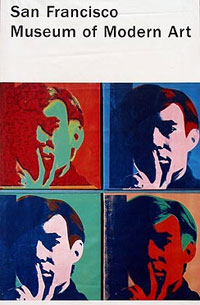 Apparently I'm not alone in the notion of seeing a museum banner hanging from a streetpole and thinking how great that would look hanging in my living room. BetterWall took that idea and turned it into a business. On their website, you can purchase banners advertising an Ansel Adams gallery at the Art Institute of Chicago or Warhol's exhibition at the San Francisco Museum of Modern Art. But these aren't just reproductions of those banners, they are the real deal.
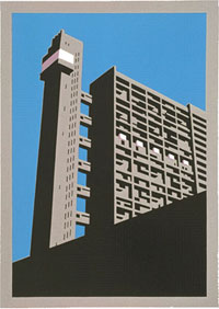 We really like the clean graphic quality and compostion of these lino prints by London-based printmaker and illustrator Paul Catherall. His designs are inspired by classic 20th century poster desgin, Soviet propaganda art and artists such as William Nicholson.
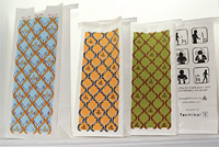
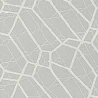
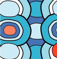 Morag Macpherson is the designer behind UK based Global Guru. A graphic artist, she has turned her talents to textile design for the interior and fashion marketplace. She's got some terrific patterns which in a way, remind us of the wallpaper patterns from
 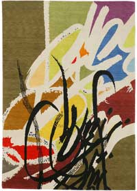 An unlikely pairing creates some very nice results in Rugged Art's collection of hand knotted carpets designed by young graphic artists such as Romon Kimin Yang and José Parla. Not to mention the fact that the prices (while not cheap) seem to us to be very reasonable for this kind quality.
 This is the nicest web photo log we've seen since
 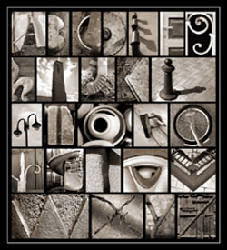 Recently while browsing the web for new prints, I came across the gallery of Abba Richman. I was drawn to many of Abba's prints, primarly because of his composition and how he captures the bold colors of many objects that we see, and perhaps ignore, everyday. His "Alphabet Series" (featured at right) is a wonderful photo essay using common everyday items to recreate the alphabet.
 This ten day festival taking place between September 20 and 30 in London, England, features all manner of design from graphics to products, photography to fashion, architecture to interiors and everything in between. The festival spans the city with exhibits, lectures, screenings, parties and seminars. Events are individually priced.
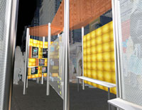 Interested in Panelite but not sure how to apply it? Looking for slightly different yet creative ways to use it? ID Magazine invited three designers to get creative with Panelite and the resulting concepts are "sweet".
 "Bruce Mau Designs collaborates with some of the world's leading architects, artists, writers, curators, academics, entrepreneurs, businesses and institutions." Just a couple of his well known designs are the font commissioned for the Walt Disney Conert Hall in Los Angeles (yes, a Frank Gehry connection) and the design for Rem Koolhaus's book S, M, L, XL. How about a little Bruce Mau on your couch? He has created several panel fabric patterns for Maharam.
 Reasonably priced "digital thermal prints" that are sure to add a touch of color to any interior.
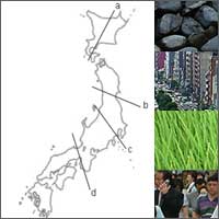 A photographic documentation of the travels in Japan of two scholarship winners; Roche Scholarship winner Colin Franzen and SOM Traveling Fellowship recipient Zane Karpova. Four "sections" cut across the island were chosen as paths of travel and documentation. The images are keyed to these lines of investigation revealing a wonderful array of landscape, architecture, culture and space.
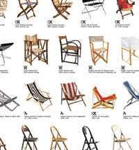 Over at Designboom, we stumbled across this fantastic poster. It has been in production for quite some time, but we still think it's pretty cool. It features everything from early Egyptian and Chinese folding stools, to contemporary chairs by James Irvine, and just about everything in between. 196 chairs in total.