This video was created as part of Jonathan Jarvis's thesis work in the Media Design Program at the Art Center College of Design in Pasadena, California.
I'm totally sick of the pervasive references to the economy in the media and advertisements, but this is worth a look.
The new animated logo of The Cooper Union makes me go "hmmmm"
In the world of graphic design, there is perhaps no more basic, yet simultaneously complex design problem than the logo. A logo (or logotype) is ultimately an identifying symbol; the visual marker for a brand. But what are the elements of a great logo? Traditionally, a "good" logo should meet some basic criteria, and there are countless rules of thumb by countless designers, but these four basics described by designer David Dairey are how I have always thought of what makes a good logo: it is describable, memorable, effective without color, and scalable.
There are also countless examples of logos which do not meet these criteria, most are cringe inducing. But in this digital age, there are examples of logos which are designed to inhabit the confines of digital space; and the confines are, well, much less confining. The new logo for The Cooper Union is perhaps the best example of this trend. It is elemental and basic, yet describes the complex of the institution it represents (view: full animation, website intro version). It meets the first two criterial of basic logo design, it does not meet the third, and I think it is questionable on the fourth.
But most notably, it is clear that this logo was designed for digital space; it relies on movement to fully reveal its meaning. While I like the design, I wonder how this logo can function for the institution when it comes to the (current) necessity of static use. And in general, what does this mean in the world of identity design?
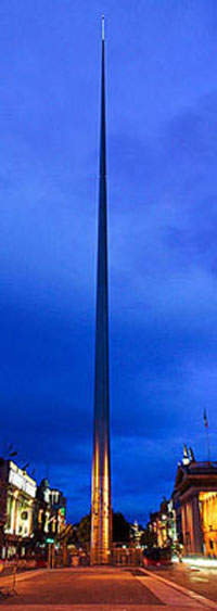
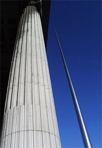
A day on which one can't help but think of monuments and symbols seems like an appropriate time to take a look at a successful modern monument... at least Witold Rybczynski thought so, and it got me to thinking about it as well.
The Spire of Dublin, also known as An Tur Solais (the Monument of Light) and The Spike... it also has some unsavory nicknames in the Dubliner tradition: The Stiletto in the Ghetto, The Nail in the Pale, The Binge Syringe, and (perhaps my favorite) The Erection in the Intersection.
The monument was conceived in the early 1990's to provide a replacement for Nelson's Pillar which was blown up by former IRA members in 1966. An architectural competition was held with the intention of building the monument in time for the millennium. Alas construction was delayed by a pair of lawsuits filed by failed competitors - one designed a resurrection of Nelsons Pillar but topped by a bronze sun, the other a column topped by a revolving restaurant...
Of course monuments are contentious by their very nature - e.g. Ground Zero, Alex Eiffel, World War II Memorial in Washington, D.C., etc. And the sore losers of the competition weren't the only detractors of the winning entry - public opinion and politicians decried the monument citing its inappropriateness to the context, the exorbitant cost and everything in between. Not to mention the planning process and environmental regulations (EIS). It is a wonder it was ever built at all... and so it is perhaps a fitting symbol of the new Ireland where such things are possible. And yet that uncovers an ironic twist: this monument of the new Ireland, built to replace a symbol of British imperialism, was an entry by a British architect, Ian Ritchie.
"Architorture" -- this term has been the lament of countless aspiring architects for years... who knows, perhaps for generations. It is a simple slang word which embodies a range of emotions, experiences and tribulations faced in the course of an architectural education... and career.
And now "Architorture" is a documentary being created by architects David Krantz and Ian Harris (et. al.) that follows five students through the process of developing their thesis projects.
Content is currently evolving with occasional uploads. Current features are "The Confessionals" where different people explain what Architecture is about in their experience.
Some random musings on CA Boom 4 so far... (readers of my ramblings will be rewarded with links to home tour galleries, as yet un-posted content)...
I really like the new metal CA Boom sign hung in the entry area this year. Nice touch, and impressive to those of us who are easily distracted by shiny objects.
Speaking of easily distracted, did anyone else notice the use of cleavage employed by a few vendors to lure people into their booths... or was is just me? You vendors who weren't packing them in, take note.
Bottled water. This is what I was handed as I checked in yesterday morning. A simple and thoughtful gesture. It always seems to be a perfect sun-shiny California weekend when CA Boom rolls around, and it is nice to stay hydrated out there on the home tours. Stocked coolers were on hand at every stop on the tour. Nicely done, CA Boom. Corona in those coolers would work too... I'm just sayin'...
I got a free t-shirt from the Eames Office... I'm wearing it right now. Thanks Eames Office!
It is always interesting to see who is attending CA Boom... what architects are lingering about, any faces in the crowd.... not that I'm not very good at spotting people, but the name tags always help. Yesterday was pretty much a bust compared to years past, though the people watching was interesting. I spyed some architects below rising-starchitect caliber touring the homes... it is fascinating to watch architects looking at someone else's work.
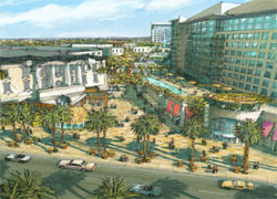
There is nothing more glamorous for an architect than designing America's malls... except perhaps designing 13,000 square foot faux-Tuscan additions to 9,000 square foot even-more-faux-Tuscan houses... ahem.
This project in Anaheim, California, has been in the proposal stage for years, and it appears that it is finally going to move forward. Situated right across the street from Disneyland, the architects absolutely had to out do themselves... and indeed they have turned architecture on its head. Don't believe me? Let's take a closer look just for shits and giggles...
Link: GardenWalk
Via: Curbed (LA style) - Anaheim Approves New Tourist Trap
Gregory Colbert’s photography and motion picture exhibit “Ashes and Snow” opened about a month ago along the Santa Monica Pier. It is housed in a rather extravagant temporary structure designed by Shigeru Ban, in which it will be traveling the world. The stacked shipping containers, the 30’ high cardboard columns, and the exquisite lighting of the space and the art all come together to create a cathedral-like space and striking experience. The visitor is lead over a wooden deck in the center of the structure, while the walls and ceiling are dipped into darkness due to the careful lighting design. The prints appear to hover between the evenly spaced columns, which makes for a beautiful procession.
Ban’s work with recyclable and reusable materials has fascinated me for many years, and this project does not fall short by any means. As for the photography and the films that are displayed inside… that is a different story.
Getting back to Ireland as promised, let's take a look at some modern Irish architecture in Dublin. Although Adriean did not tag along with my wife and I on our trip... at least not that I know of... he was feeling the Irish architecture vibe as well with his post highlighting some of this year's RIAI (Royal Institute of the Architects of Ireland) award winners.
Following is more of what I have seen in Dublin... I will sprinkle some comments in with the photos. For those who want to dig deeper, check out The Reflecting City. This site is part of a current mixed media exhibition detailing the urban transformation in Dublin over the past decade. The site allows you to delve into the history, present and future of city via an interactive zoned map. The site focuses on nine districts and provides related images, interviews, virtual tours and abundant information related to the community, planning and projects.
Five days after returning from nearly two-weeks in Ireland, I am finally shaking the lingering jetlag and feeling motivated enough to begin to sort through some of my photos and recollections.
This trip was an anniversary trip with my wife who is not quite the design fanatic that I am, therefore seeking out examples of modern Irish design was not on the itinerary. But we came across enough in passing... but not too much so as to upset the missus.
A bit of light content follows... a brief description of our journey and some random images with more detailed content in the next few days.
My September (2005) journey, through Tyrol - Austria, allowed me to explore about 15 MPreis supermarket stores; driving through towns along a 100 km route, west and east of Innsbruck.
The following images and text describe some of the MPreis locations I visited and my overall impression of the chain and it's unconventionally designed stores.
Making a case for native and climate-appropriate plants
We occasionally show our southern California bias... but I am not sure why the New York Times shows theirs so often.
The New York Times published an article yesterday profiling proponents of "native" plants in California, focusing on Rene Russo's crusade to promote native species... an interest we share and which we subtly display with our side bar Dudlea image. In my experience, newspapers are infamously inept in their coverage of nature and landscape, and while this article is interesting and worth reading, I find the poor reporting to be annoying. For example:
Native plants like senecio and aloe, which fill the yard in front of Andree Matton's house in Monrovia, Calif., thrive on less water than grass.
Senecio and aloe are not native even to this continent, let alone to Monrovia, California.
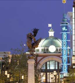
It has been a little while since we have visited this topic, but an article in Metropolis by Karrie Jacobs ties into some issues we have touched on here before... so nice of Karrie to help us weave some things together.
The article covers some territory we have crossed before with some nice observations and observations. She provides a critique of the "need to use the past as a sort of architectural tranquilizer" and takes a look at the lifestyle center phenomenon, specifically talking about Victoria Gardens (see Downtown Mauled Part I & Part II). Though I would disagree with her stance which places blame for architectural pastiche squarely on New Urbanism as its agenda is more spatial than aesthetic.
Michael Bierut at Design Observer wrote a great piece on how designers talk about their creations. A perfect follow up to our post on design school reviews.
Yesterday I had jury duty... at the University of Southern California Department of Landscape Architecture. I had the opportunity to critique (along with Mark Rios, Mia Lehrer, Clark Stevens, and other jury members) the final presentations for a landscape architecture studio co-taught by David Fletcher and Tom Leader.
I will provided an overview of the student projects next week... the studio was very interesting and the work of a high caliber... but today I want to talk a bit about the design education hazing ritual known as the "crit."
John Norquist responds to Mr. Greenhut's demonization of New Urbanism
John Norquist, president of the Congress for the New Urbanism in Chicago, provides a rebuttal that is admittedly more studied and level headed than our own in response to a scathing editorial published earlier this month in the Orange County Register by Steven Greenhut.
Some of the opinions and facts presented by Mr. Norquist seem to reveal that Mr. Greenhut may actually be a closet New Urbanist... or, more seriously, help to dispel many of the misconceptions about New Urbanism held by many.
We are heartened to see that Mr. Greenhut has chosen to engage in debate and will speak at the annual meeting of the Congress for the New Urbanism in Pasadena this June. If he doesn't drink the kool-aid, we will at least be interested to read a more educated editorial from Mr. Greenhut in the future.
"Malls are now being designed to resemble the downtown commercial districts they replaced."
Andrew Blum has come to some concerns and conclusions similar to our own when it comes to the lifestyle center phenomenon. In an article published today on Slate, he talks about the evolution of malls and the appropriation of "public space."
The lifestyle center is a bizarre outgrowth of the suburban mentality: People want public space, even if making that space private is the only way to get it.
Sometimes it doesn't matter what opinion I may hold when I read gibberish spewed by someone feigning authority. Mind you, I am not a journalist (most traditional journalists would be quick to point out that journalistic shortcoming of blogs), but I am an educated professional with experience, opinions and knowledge that give me some background from which to judge the worthiness of an argument within my field. I have read the opinions of many educated opponents of New Urbanism that I can respect, but an article published Sunday in The Orange County Register written by Steven Greenhut is not among them.
Now, I do not consider myself an expert in New Urban theory, but I do think that Mr. Greenhut is grossly misinformed. Or perhaps he just enjoys lighting a fire and fanning the flames. At any rate, he misses the concept that New Urbanism promotes a mix of housing types and income levels and that the principles can be applied to lower density situations. Mr. Greenhut has bitten off more than he can chew... and indeed more than can even be responded to in this format. Never the less, let's take an abbreviated look, shall we?
Related to our continuing concern with the privatization of public space, here is an interesting situation featuring Anish Kapoor's Cloud Gate sculpture in Chicago's Millennium Park.
According to a post at New (sub)Urbanism, photographer Warren Wimmer was prevented from photographing this piece of public art.
Over in the Archinect forums, a member with the moniker Suture has written an interesting little rant about how Dwell is slowly changing from a magazine that once featured hand made coffee tables and stenciled walls to one that now features individuals tooling around in "mid 50's Mercedes" toting "$1000+ worth of luggage" and can afford "$20,000 plus worth of iconic Mies furnishings". I guess it's been a long transition because I never really noticed it, but now that he mentions it, it suddenly stands out so well.
"Where they once documented honest, affordable projects that did not strain to be trendy, they are now profiling unfinished projects (or was that a proposition for a new temporal plywood design) (p96) just so they can stuff crass advertising down peoples throat (back cover and 123), sell branded shoes (see p127), sell not very accessible or ecologically friendly cars (p 27 and they have had H2 ads before)...sadly the list goes on. I wont even touch the out of control and exponentially growing ad section in the back that is busting at the seams."
So, we pose the question: Should Dwell go back to leaning more to the Ready Made side of the fence or should they continue on their current path catering to the Elle Decor crowd? Comment below!
Ikea is at it again. Knocking down the past to build a big-box emporium to hock their mass produced modern design wares. Here is a company that takes advantage of their Scandinavian design heritage to sell inexpensive, yet "well designed" products to the masses. But, in the process, they have now displayed two blatant instances of their disregard for design legacy. First, they defaced a Marcel Breuer building in New Haven, Connecticut. Now the wrecking ball has turned to Civil War era structures in Brooklyn.
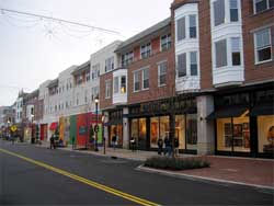
Crocker Park, another faux town is born outside of Cleveland, Ohio
It's a mall. Another mall. It isn't even an old town center that has been revitalized and has mall-like characteristics. It's another mall themed as a town. And yes... it's another post about lifestyle centers. Sheesh, why don't we give it a rest already?!
Because the "lifestyle center" continues to spawn and spread across the country... and the more that open, the more alarmed the we are by the trend. The Plain Dealer features a critical look at the good and the bad of Crocker Park in the Cleveland suburb of Westlake. The article touches on many of the same issues that we have been stewing over in recent commentary posts.
If it looks like a town and feels like a town, it isn't necessarily a town.
Today's breed of mall, dubbed, "lifestyle centers," may want to serve as surrogate town centers, but strip away the facades, the faux layers of history and the rhetoric, and they are private malls. Just ask the guy in Texas who tried to circulate a petition at one of these "town centers".... errr, malls. The developers may love the fact that their malls somehow fulfill the function of a downtown, but only so far as consumption is concerned. Make no mistake, the open space amenities of these centers are only masquerading as public space. The sidewalk is private, the "town square" is private. Free speech does not necessarily have the right to occupy this realm. No longer is fantasy contained within the box of the television set, or in the theatre, or behind the ticket booth at the theme park.
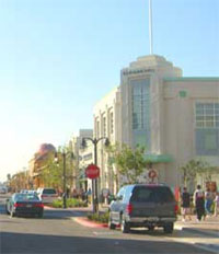
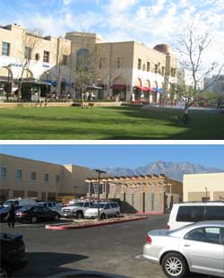
Victoria Gardens: the illusion continues in Rancho Cucamonga
Victoria Gardens is not a ground breaking step in the evolution of malls. The idea borrows from New Urbanist concepts fused with the concepts or retail design explored by John Jerde. Similar to Jerde’s work, Victoria Gardens is, to borrow the words of Margaret Crawford, "between the commercial and the artistic, the popular and the pure, and, of course, the high and the low."
But Victoria Gardens is no City Walk, its ambitions are much less hyper-realistic, and perhaps this is what sets it apart from many other themed malls that we have seen. But the result is a somewhat duplicitous place that insists it is one thing when it is actually something else.
Victoria Gardens: suburban mall impersonates a town center in Rancho Cucamonga
This former agricultural center 50 miles east of Los Angeles was once home to sprawling groves and vineyards, but has been more recently known for the sprawl of big-box mini-malls and cookie cutter tract homes. Now a new development seeks to be the downtown that Rancho Cucamonga, California has never had.
The New York Times saw fit to cover the opening of this new mall, so we figured that it was worth the 40 minute drive to check it out. City planners had originally envisioned a more traditional mall, but the developers had a bold idea that breaks many (though not all) of the rules of the typical mall development. The idea behind Victoria Gardens is not new, pseudo-historic town centers are the core of most New Urbanist neighborhoods, but here it has been inserted into an existing tract home city.
The name of this mall betrays its form; all of the shops are located along an urban grid of streets open to vehicular traffic, complete with parking meters and sidewalks. Parking lots and service areas located in the center of the blocks, much like a traditional American town. "Victoria Gardens" fails to provide a hint of the urban space that has been created, or perhaps this was an intentional move to calm local residents who may fear density.


 A day on which one can't help but think of monuments and symbols seems like an appropriate time to take a look at a successful modern monument... at least
 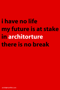 "Architorture" -- this term has been the lament of countless aspiring architects for years... who knows, perhaps for generations. It is a simple slang word which embodies a range of emotions, experiences and tribulations faced in the course of an architectural education... and career.

 There is nothing more glamorous for an architect than designing America's malls... except perhaps designing 13,000 square foot faux-Tuscan additions to 9,000 square foot even-more-faux-Tuscan houses... ahem.
 Gregory Colbert’s photography and motion picture exhibit “Ashes and Snow” opened about a month ago along the Santa Monica Pier. It is housed in a rather extravagant temporary structure designed by Shigeru Ban, in which it will be traveling the world. The stacked shipping containers, the 30’ high cardboard columns, and the exquisite lighting of the space and the art all come together to create a cathedral-like space and striking experience. The visitor is lead over a wooden deck in the center of the structure, while the walls and ceiling are dipped into darkness due to the careful lighting design. The prints appear to hover between the evenly spaced columns, which makes for a beautiful procession.
 Getting back to Ireland
 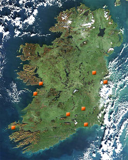 Five days after returning from nearly two-weeks in Ireland, I am finally shaking the lingering jetlag and feeling motivated enough to begin to sort through some of my photos and recollections.
 My September (2005) journey, through Tyrol - Austria, allowed me to explore about 15 MPreis supermarket stores; driving through towns along a 100 km route, west and east of Innsbruck.
 We occasionally show our southern California bias... but I am not sure why the New York Times shows theirs so often.
 It has been a little while since we have visited this topic, but an article in Metropolis by Karrie Jacobs ties into some issues we have touched on here before... so nice of Karrie to help us weave some things together.
 Yesterday I had jury duty... at the University of Southern California
 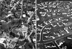 John Norquist, president of the Congress for the New Urbanism in Chicago, provides a rebuttal that is admittedly more studied and level headed than our
 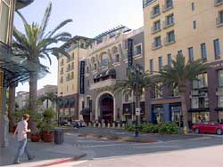 Andrew Blum has come to some concerns and conclusions similar to our own when it comes to the lifestyle center phenomenon. In an article published today on Slate, he talks about the evolution of malls and the appropriation of "public space."
 Sometimes it doesn't matter what opinion I may hold when I read gibberish spewed by someone feigning authority. Mind you, I am not a journalist (most traditional journalists would be quick to point out that journalistic shortcoming of blogs), but I am an educated professional with experience, opinions and knowledge that give me some background from which to judge the worthiness of an argument within my field. I have read the opinions of many educated opponents of New Urbanism that I can respect, but an article published Sunday in The Orange County Register written by
 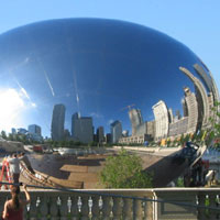 Related to our continuing concern with the privatization of public space, here is an interesting situation featuring Anish Kapoor's Cloud Gate sculpture in Chicago's Millennium Park.
 Over in the Archinect forums, a member with the moniker Suture has written an interesting little rant about how Dwell is slowly changing from a magazine that once featured hand made coffee tables and stenciled walls to one that now features individuals tooling around in "mid 50's Mercedes" toting "$1000+ worth of luggage" and can afford "$20,000 plus worth of iconic Mies furnishings". I guess it's been a long transition because I never really noticed it, but now that he mentions it, it suddenly stands out so well.
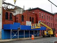 Ikea is at it again. Knocking down the past to build a big-box emporium to hock their mass produced modern design wares. Here is a company that takes advantage of their Scandinavian design heritage to sell inexpensive, yet "well designed" products to the masses. But, in the process, they have now displayed two blatant instances of their disregard for design legacy. First, they defaced a Marcel Breuer building in New Haven, Connecticut. Now the wrecking ball has turned to Civil War era structures in Brooklyn.
 It's a mall. Another mall. It isn't even an old town center that has been revitalized and has mall-like characteristics. It's another mall themed as a town. And yes... it's another post about lifestyle centers. Sheesh, why don't we give it a rest already?!
 If it looks like a town and feels like a town, it isn't necessarily a town.
 Victoria Gardens is not a ground breaking step in the evolution of malls. The idea borrows from New Urbanist concepts fused with the concepts or retail design explored by
 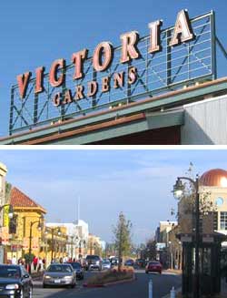 This former agricultural center 50 miles east of Los Angeles was once home to sprawling groves and vineyards, but has been more recently known for the sprawl of big-box mini-malls and cookie cutter tract homes. Now a new development seeks to be the downtown that Rancho Cucamonga, California has never had.