After years of chatter around the blogoshpere, Kanner Architects' unique gas station on Slauson and LaBrea in Los Angeles finally opens for business. At least that is what our sources tell us...
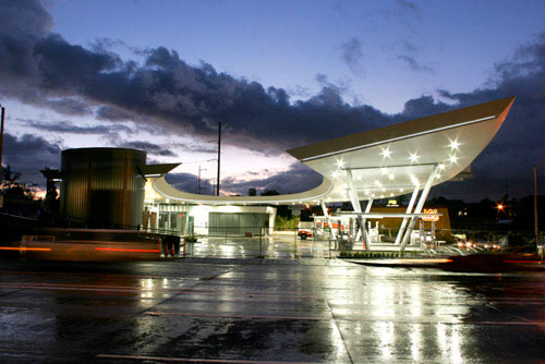
Aaaand... we are still not able to get this bit of insider information up on the web before a certain someone else did earlier today. Oy vey! So rather than telling you about all the delays, the praise and criticism, the Dutch seamless flooring, Spanish glass tile, monstrous curved channel glass, and massive amount of beautifully crafted stainless steel that was used in this project, we will just provide you with some eye candy recently taken on site. You be the judge...
Photo gallery: United Oil (L+L)
Architect: Kanner Architects
Wall displayed airplants at the Bardessono Hotel
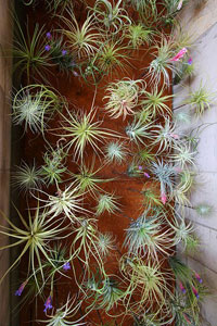 A very nice indoor vertical garden designed for a space without irrigation or drainage at the platinum LEED certified Bardessono hotel in Yountville, California.
The simple solution uses airplants (Tillandsia, members of the Bromeliad family) attached to metal rods which protrude from the wall. The visual effect of hundreds of Tillandsia "floating" within these alcoves is striking. And while some of the plants will need to be changed out occasionally, it is a much more sustainable solution than the typical hotel lobby floral display.
Link: Thigmotropism
Link: Bardessono Hotel
Article: NYT
Location: L+L Maps - Bardessono Hotel
Urban — February 17, 2009
Posted by James
Screw the rules of the road
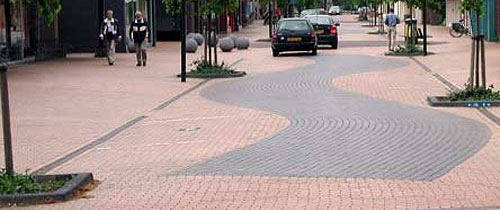
More than two years ago, I read an article by LA based journalist Sam Kaplan talking about what he called "woonerfern," a Dutch concept of street design which blurs the boundaries of traffic separation and use. However a quick web search for "Woonerfern" will turn up nothing other than references to this article by Mr. Kaplan, and using a Dutch-to-English dictionary was no help either. A bit more research, and AH-HA! I discovered the term "Woonerf" (or the plural "Woonerven"), a concept developed in the late 1960's and early 70's which is credited to the late Dutch civil engineer Hans Monderman, who's philosophy of road design throws out the conventional wisdom that driving and walking are incompatible and that traffic must be directed and controlled by signals and signage.
The concept has evolved into numerous variations of philosophy: Home Zones, Shared Space, Living Streets, New Mobility, etc. But never mind what it is called, the concept of a street serving multiple functions is an interesting one. It expands the possibilities of walkable, sustainable cities which accommodates the automobile, but emphasizes and encourages alternate modes of movement and inhabitation of the street-scape--linear public space. Plus, it is just a good era to revisit 'infrastructure' rather than, say, sexy modern mountain vacation homes. So, let's take a look at shared spaces, shall we?
Link: Salon - Why don't we do it in the road?
Link: NY Times - A Path to Road Safety With No Signposts
Link: Wired - Roads Gone Wild
This ain't your grandma's floral paper
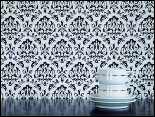 Perfect for Valentine's Day, Atelier Blink's 2006 wallpaper, Rendezvous, draws on inspiration from grandma's wallpaper of days past, but with a Kamasutra twist.
Link: Atelier Blink
Link: Vlaemsch()
The new animated logo of The Cooper Union makes me go "hmmmm"
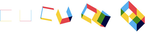
In the world of graphic design, there is perhaps no more basic, yet simultaneously complex design problem than the logo. A logo (or logotype) is ultimately an identifying symbol; the visual marker for a brand. But what are the elements of a great logo? Traditionally, a "good" logo should meet some basic criteria, and there are countless rules of thumb by countless designers, but these four basics described by designer David Dairey are how I have always thought of what makes a good logo:
it is describable, memorable, effective without color, and scalable.
There are also countless examples of logos which do not meet these criteria, most are cringe inducing. But in this digital age, there are examples of logos which are designed to inhabit the confines of digital space; and the confines are, well, much less confining. The new logo for The Cooper Union is perhaps the best example of this trend. It is elemental and basic, yet describes the complex of the institution it represents (view: full animation, website intro version). It meets the first two criterial of basic logo design, it does not meet the third, and I think it is questionable on the fourth.
But most notably, it is clear that this logo was designed for digital space; it relies on movement to fully reveal its meaning. While I like the design, I wonder how this logo can function for the institution when it comes to the (current) necessity of static use. And in general, what does this mean in the world of identity design?
Link: Cooper Union
Designer: Doyle Partners
Article: NY Times

